Sometimes it really boggles my mind some of the things that are overlooked in games. It is fair enough if you think about how much goes into them, it would be easy for someone to leave something out or not think of something. But you'd think along the way someone might go, hey, I can't tell who is who here.
Reading a review on Brink has got me to thinking about not only game design principles but animation ones as well. A lot of them tie in, and can be lost when people are focusing on making something mechanically playable, something that works, they may forget a few other really simple things.
Strong silhouettes. They go a long way. This is a key animation principle. Maybe I'm just taking this knowledge for granted having already studied animation, but it seems a pretty obvious design element when making something someone is going to look at. In a game you want them to be able to instantly know what something is and be able to tell it apart from anything else in the world.
Most games do this great in other ways, you can almost always tell what will give you health, what is probably going to kill you. I can only think of one game off the top of my head (doesn't mean all other games dont't do it to some degree and that there aren't ones that do it as well or better) but Team Fortress 2 has great use of silhouettes. I can tell immediately who is who just from, the silhouette. Which is such an important thing. Games not necessarily require that, but I think looking at some animation principles and combining those really couldn't hurt.
Maybe it's silly, but I really feel I have some advantage having studied animation before I came into games. More knowledge can only be a good thing. Everyone loves that guy that brings 5 dishes to the table.
Now I'm hungry.
Monday, 27 June 2011
Thursday, 2 June 2011
Up Up Slide art style
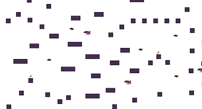
So I have now pretty much done my art, at 3am. Before I go to sleep gonna put up some of my stuff, how it looks and stuff.
Things to do
- walk cycle for character
- have the birds turn around
-sleep (probably first)...(maybe)..
Things to do
- walk cycle for character
- have the birds turn around
-sleep (probably first)...(maybe)..
Anyway, time for me to take a break.
General Up Up Slide update
So it appears I have been mostly documenting stuff either in my required project journal thing or in this book I carry around and scribble in when ever I think of something or need to work out a problem. I am all kinds of visual and kinetic. I need to write stuff out and look at it. Anyway, this is just a regular update of sorts.
So my original idea of having the player slide off of the platforms has come to, hurdle. The rotational collision in Flash is kind of silly so I can either put more work in and find a work around probably using matrices or I can just put that on hold and work it out later when I have more time and feel like continuing this game. (possibly in a whole other program, maybe I'll use it to teach myself a new language, that isn't AS3 and is in no way related to Flash at all) *cough* So I have come up with a better idea.
By better I mean I can implement it now (and have) and it still keeps the game how I want it to be. The player feels like they have to keep moving. So I have birds flying about that knock you off platforms, this rises the anxiety meter I have, (of course you can reduce it by finding anxiety pills, I'm not mean or anything) which when it becomes too high, you die and respawn back down the bottom. I don't have a set amount of lives yet, kind of an infinite tries thing. Also I want to have it so if you stand still for too long it starts to rise as well. All this will mean the player has to keep moving or, die. Or faint whatever.
Things I need to do
- stop procrastinating (yes, this blog is great procrastination)
- get more enemies in (I want some birds with more A.I., so they swoop and stuff)
- get a menu working
- have some set lives as well as the meter (If I have a menu, guess I should get this happening too)
- artwork! (usually I do this earlier, but I kind of liked how it looks right now, but admittedly the birds should be more bird like. Adding enemies has me convinced it needs a new style now. Now it looks dodge.
- another level could be cool
- polish code and game
Enough procrastination now, time to code it up!
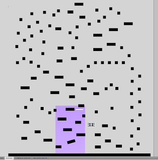
Oh here is what the level set up looks like now. Also, check out previous posts for some runthroughs of the game.
Wednesday, 1 June 2011
Getting all the game run throughs.
I have enemies now that knock you off platforms, a pickup that restores your anxiety meter, and a ladder at the end which is how to "win" the level. Not that anything happens yet.
Next up, something happens when you win, some menu's and artwork times.
Up Up Slide - Enemy test from Francis Fitzgerald on Vimeo.
Next up, something happens when you win, some menu's and artwork times.
Up Up Slide - Enemy test from Francis Fitzgerald on Vimeo.
Tuesday, 31 May 2011
Up Up Slide Level Runthrough
Video of a quick run through of the first level setup in my game.
Up Up Slide Level Test 01 from Francis Fitzgerald on Vimeo.
Up Up Slide Level Test 01 from Francis Fitzgerald on Vimeo.
Level setup
Been awhile sine I updating anything about the game I am working on. So here is some stuff. Got collision going and character movement, jumping and such. Needs some tweaking to get the jump to be just right. I have an anxiety meter set up and a HUD class to control it and anything else I see fit to put up there. Pretty pleased with the progress, tomorrow I shall throw in some enemies, get some things to trigger anxiety changes and throw in some anxiety pills to bring it back down. Sounds like a plan. If I can fit all that in with filling in paperwork for an assignment due Thursday. =/
But less about that and now to some images of my level setup. I do have a video of a quick playthrough currently uploading but probably won't finish anytime soon (free Vimeo account and apparently my internet is slow tonight) so I'll post it tomorrow.
This one here was my first setup I did tonight, then something funny happened and I had to redo it...
Got pretty close aye? So this is the one I got going now, I think.
Anyway, got to get up in4 or 5 hours, time for a bit of sleep.
Subscribe to:
Comments (Atom)


